Vytio IPTV Analytics Guide
1. Introduction
IPTV Analytics provides useful insights in how different aspects of IPTV systems are used.
2. Analytics Metrics
The set of analytics metrics are defined in this section along with a simple illustrative example.
2.1 Definition
The analytics include the following metrics:

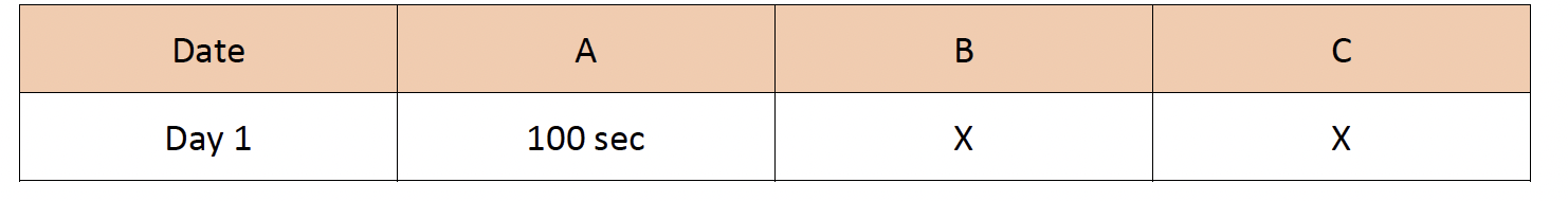
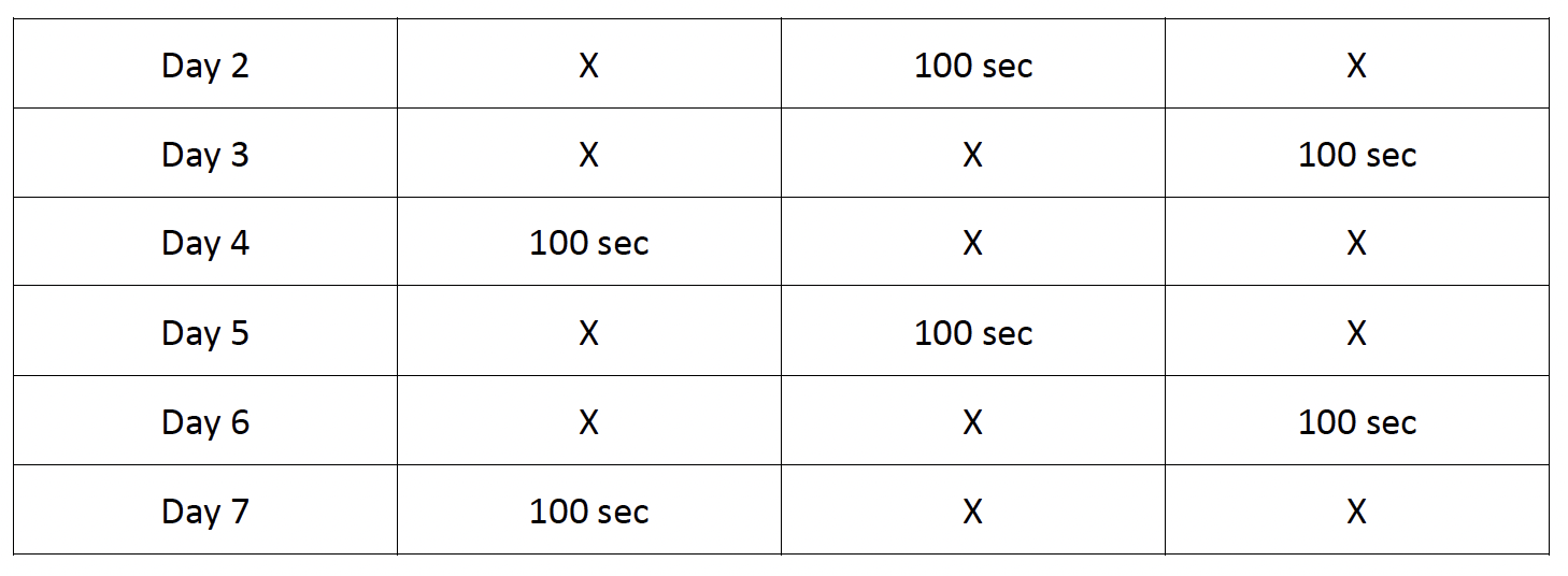
2.2 An Example
There are three distinctive viewers A, B and C and their uses of a feature over a 7-day period is as follows:
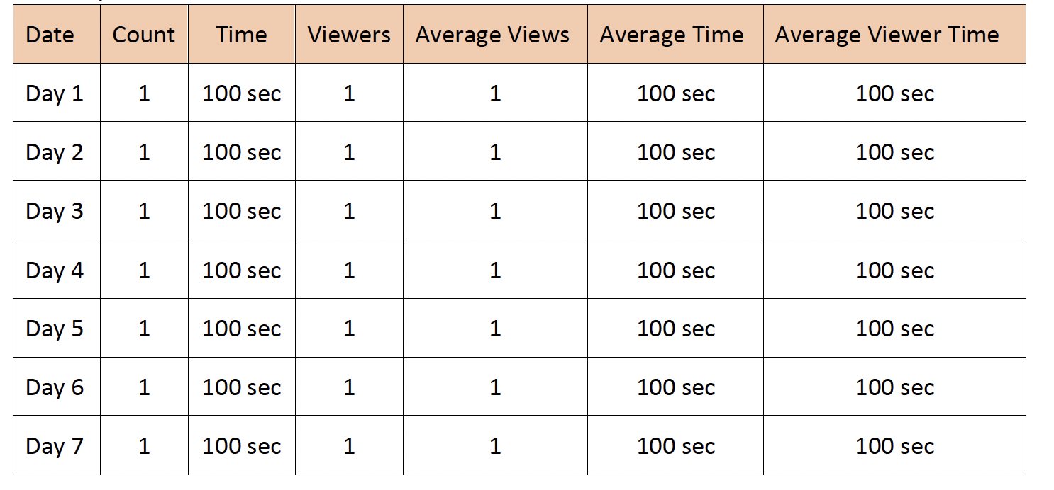
The daily metrics are:
The weekly metrics are:

3. Analytics Categories
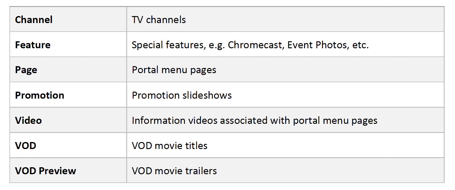
The analytics data are organized into the following categories:

4. Access Analytics Console
To access the Analytics:
1. Navigate a web browser to http://<server_ip>/console, where <server_ip> is the IP address of the IPTV server
2. Enter Account, Password and Site information
3. Click the Login button

5. Analytics Console Structure
Analytics Console has the following main areas:
1. The date range selection on the left pane
2. The category, the metric and the type of chart selections on the top of the right pane
3. The charting area, if shown
4. The data table

5.1 Select Date Range
The Analytics maintains up to the last 30 daily data, last 4 weekly data and last 4 monthly data.

To see the data of a daily, weekly or monthly, click it and the related data are shown on the right pane.
5.2 Select Category
The first dropdown list on the top of the right pane shows the list of dimensions.
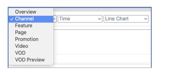
Select the desired dimension, say Channel, to see channel related usage data and charts.
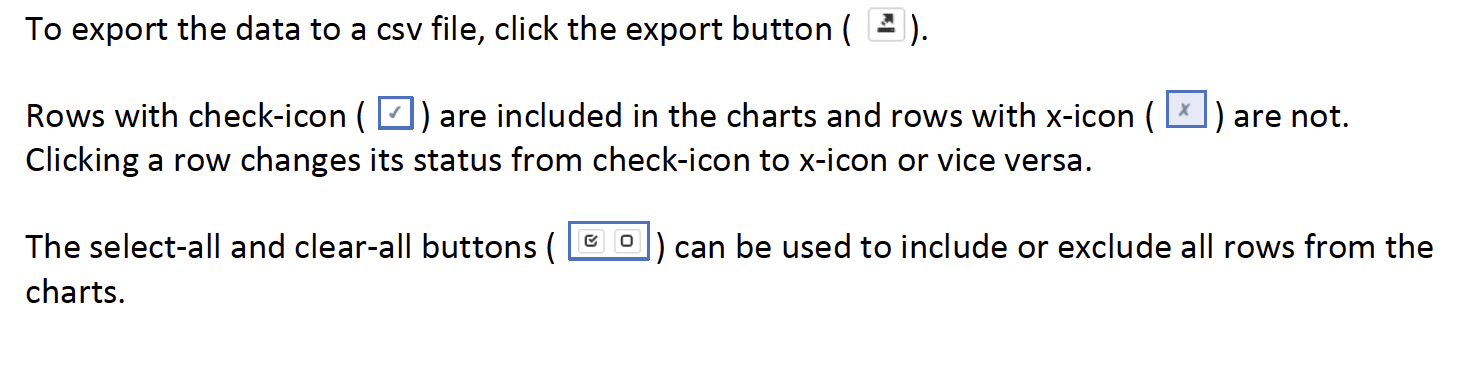
5.3 Operate Data Table
The data table shows all metrics of the selected analytics dimension and supports the following operations: sorting, exporting data, selecting and deselecting rows from the charts.
To sort the data table based on a specific metric, click the metric title, e.g. Time, to sort the table based on the column. Clicking the same metric title toggles between ascending or descending order.

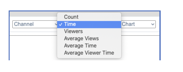
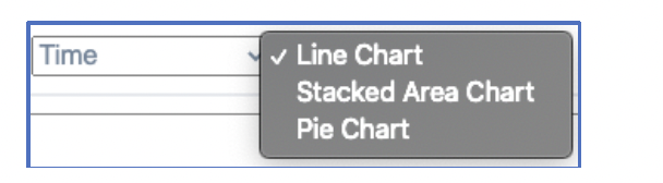
5.4 Use Charts
The data charts show the data of the selected metric in a set of chart types.
To specify the metric, click the middle dropdown list and select the desired metric.
To select the chart type, click the third dropdown list and select the chart type.
Charts often provide useful visualization of the trends and changes of a large amount of data.
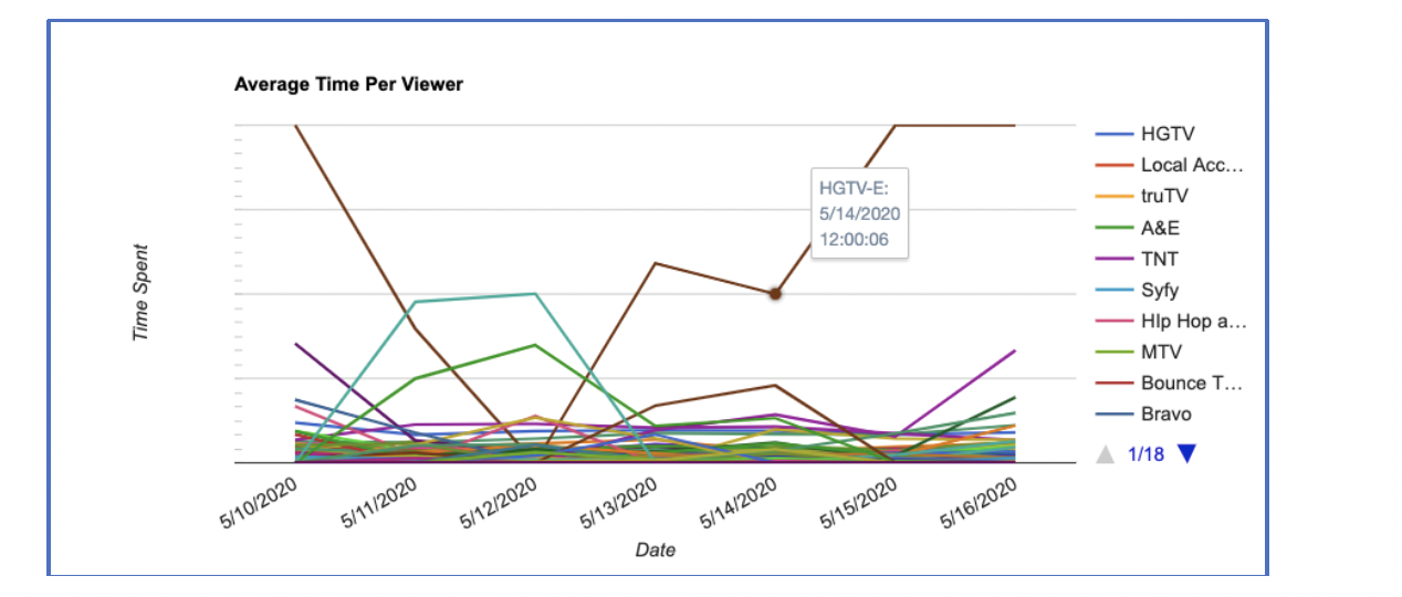
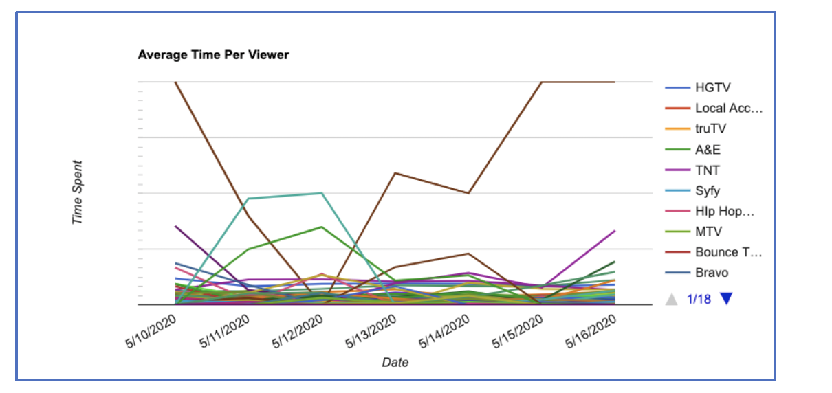
Charts also provide additional granularity. For example, the charts below associated with a weekly data table provides daily data. To see the data of a channel on a date, mouse over the point on the charts and see the information shown as the tooltip.
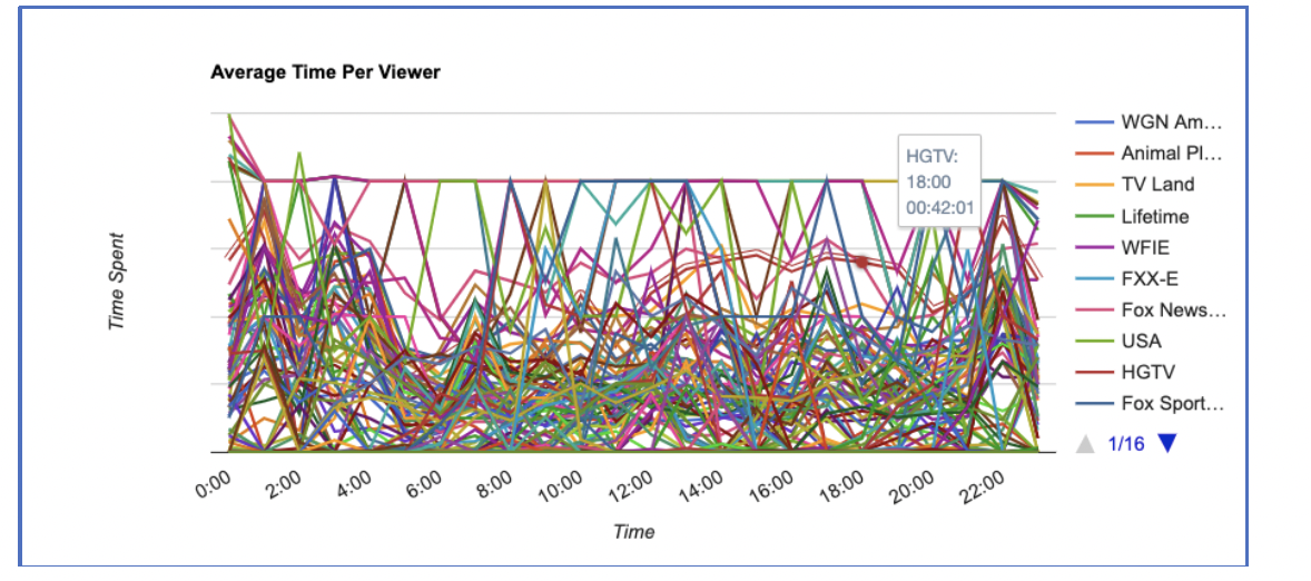
The charts below, which are associated with a daily data table, provides more granular hourly information.
5.5 Chart Types
The Line Chart shows the individual sets of data on a single chart independent of each other.
This is good for comparing the different categories against each other over a given period of time.
The Stacked Area Chart puts all the data for the given period of time together visually while distinguishing each category by color. This allows us to compare the different categories relative to the overall data and still see the changes over a given period of time.

The Pie Chart groups all the data of each category together and presents it as a single graphic.
While this chart does not show the changes over time, it makes it easy to compare the different categories in relation to the overall data.

